Honor Award
Peninsula Residence
Hillsborough, CA
Andrea Cochran Landscape Architecture, San Francisco
 Close Me!
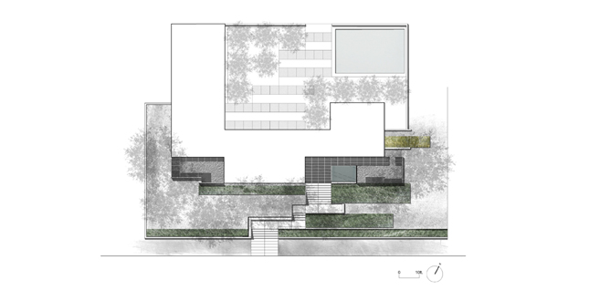
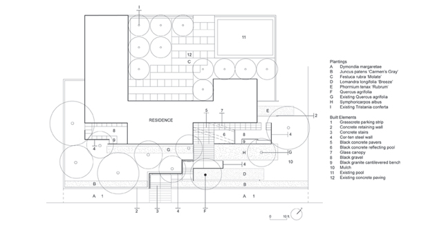
Planting and Materials Plan
Download Hi-Res ImageImage: Andrea Cochran Landscape Architecture
Image 2 of 13
 Close Me!
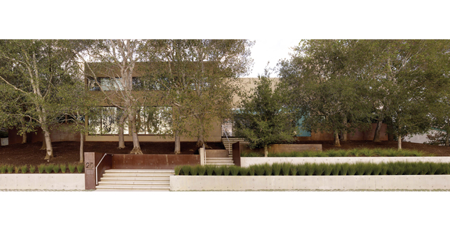
Street Elevation showing layered elements of entry sequence.
Download Hi-Res ImageImage: Marion Brenner
Image 3 of 13
 Close Me!
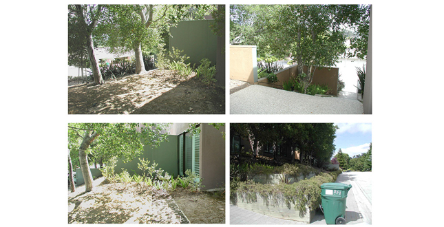
Existing condition of the front yard prior to redesign
Download Hi-Res ImageImage: Marion Brenner
Image 4 of 13
 Close Me!
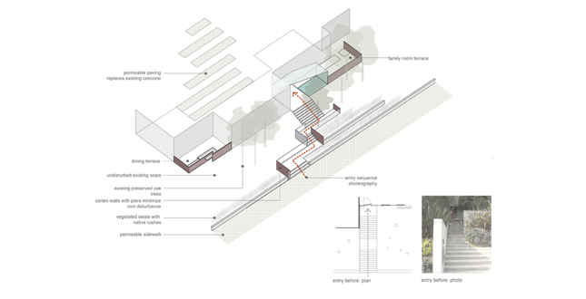
The new design maximizes the possibilities in the site's small space. It creates choreographed entry sequence and outdoor rooms while protecting existing oaks and implementing sustainable materials.
Download Hi-Res ImageImage: Andrea Cochran Landscape Architecture
Image 5 of 13
 Close Me!
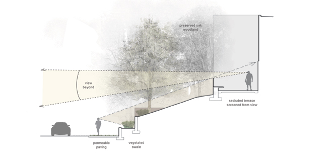
The cor-ten wall heights are calibrated to create spatial enclosure and screening from the street while allowing views from inside the house.
Download Hi-Res ImageImage: Andrea Cochran Landscape Architecture
Image 6 of 13
 Close Me!
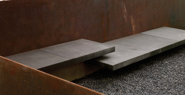
Outdoor living rooms with cantilevered seating extend from the house. Four-foot cor-ten steel walls create privacy for residents.
Download Hi-Res ImageImage: Marion Brenner
Image 7 of 13
 Close Me!
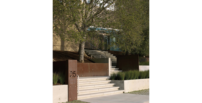
The entry sequence orchestrates a meandering approach. Cor-ten walls are carefully sited with pier foundations to minimize oak root disturbance.
Download Hi-Res ImageImage: Marion Brenner
Image 8 of 13
 Close Me!
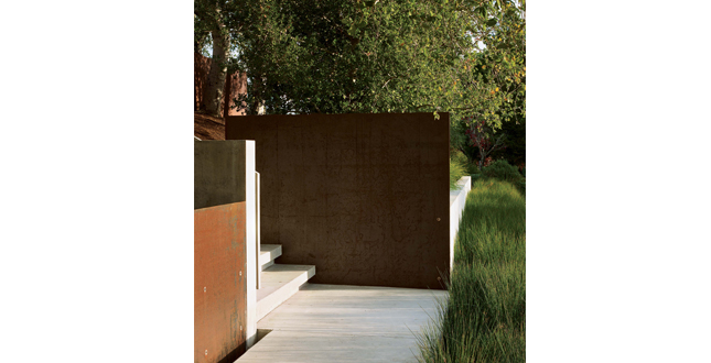
A visually rich, tactile Cor-ten steel sculptural wall anchors the turns and landings at the entry.
Download Hi-Res ImageImage: Marion Brenner
Image 9 of 13
 Close Me!
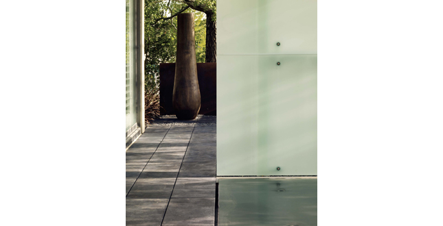
The architects, working closely with the landscape architects, designed a glass canopy to intersect the pool of water, strengthening the interplay of reflection, transparency, and shadow.
Download Hi-Res ImageImage: Marion Brenner
Image 10 of 13
 Close Me!
A detail view shows how the reflecting pool, a seamless sheet of water, flows into the hidden fountain vault below.
Download Hi-Res ImageImage: Marion Brenner
Image 11 of 13
 Close Me!
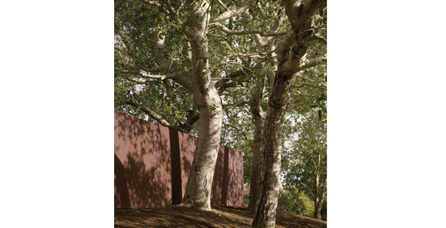
The surfaces of the walls become dynamic canvases, highlighting the sculptural qualities of the oaks.
Download Hi-Res ImageImage: Marion Brenner
Image 12 of 13
 Close Me!
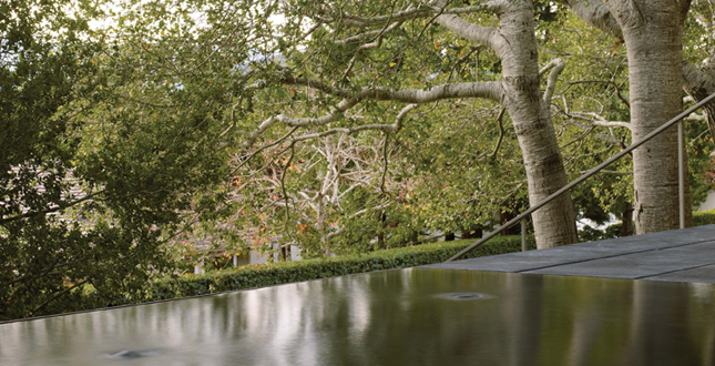
The dark surface of the reflecting pool creates a new horizon line, de-emphasizing the street and lifting the view upward into the tree canopy.
Download Hi-Res ImageImage: Marion Brenner
Image 13 of 13
Project Statement
Situated on a suburban street, the Peninsula Residence aims to create an alternative model for the standard front yard—one that is appropriate to neighborhood and the Northern California climate. The landscape design re-imagines a previously neglected slope to implement sustainable materials and an interconnected spatial relationship between public and private zones. This project exemplifies how the innovative reconfiguration of an entry can create a place that engages a home, a street, and the senses.
Project Narrative
—2011 Professional Awards Jury
In the surrounding neighborhood, two primary approaches are taken to address the yard. One creates an open lawn area, offering no mediation between the house and the street and requiring significant water and resource investment. The second approach prioritizes privacy of the domestic realm, creating a tall opaque barrier between the house and the street either with thick hedging or a privacy fence. For this 1/3 acre renovation, the design intent was to create a landscape of private refuge while allowing the front of the house to remain connected to the neighborhood. It carves out a series of intimate, interconnected rooms from a previously unused band of land in front of the house. The landscape architects collaborated closely with the architecture team to reshape space, redirect views and develop a protracted threshold sequence.
Prior to the redesign, the entry consisted of a direct, intimidating stair, leading up a steep slope, straight to the front door. The slope offered no usable space for the residents in the front of their house. Rather, this space was planted with an assortment of ornamental plants with high water use and no overall coherence. The clients, who had lived in the house for two decades, were taking the opportunity to renovate the house and garden to suit their changing needs. One powerful aspect of the existing landscape, a grove of native oak trees, planted by the current owners when they first moved to the property, was recognized by both landscape architects and clients as the most significant expression of the place’s identity.
This grove becomes the central feature of the new design. Twisted branches of these trees give character and scale to the home. The redesigned composition works to amplify the experience of these trees, while careful construction techniques allow for their roots to be protected. Paths and courtyards slip within the grove and offer a heightened perception of the trees’ sculptural qualities. A succession of walls are carefully situated to protect the oaks and allow key slopes to be undisturbed. Further, the walls’ construction method was tailored to the trees. Narrow profile cor-ten steel with a limited number of pier foundations minimizes root disturbance.
Weaving through these oaks, the design choreographs the experience of walking from the street. Each turn presents a new focus: the form of an existing tree, the rich texture of cor-ten steel and finally a reflective plane of water. The sound of water is subtly audible from the street, guiding visitors to the house. This indirect sequence invites one to pause and accentuates the process of passage.
At the upper level, courtyards extend the interior of the house into secluded outdoor living spaces. The clean edges of cor-ten steel walls and the dark reflecting pool create new horizon lines, de-emphasizing the street and lifting the view upward into the tree canopy. At four feet, the cor-ten wall height is calibrated to create spatial enclosure while allowing views from inside the house. Pavers on podium allow the reflecting pool to be detailed flush with the ground plane, playing up its role as a crafted horizon. The architects, working closely with the landscape architects, designed a glass canopy to intersect the pool of water, strengthening the interplay of reflection, transparency, and shadow.
Challenging a standard front yard material palette, this project argues that fallen oak leaves offer an appealing alternative to expected groundcover plantings. In place of the former ornamental plantings, linear bands of native rushes compose vegetated swales. The project’s subtle colors, white, warm grey, rust, black, and dusty green, layer to enhance a sense of depth. Along the public street, an asphalt parking area is replaced by planted, permeable paving, which offers neighbors a place to walk on this street that lacks a sidewalk. Permeability is also improved in the backyard terrace, where the designers removed strips of concrete in favor of porous material.
Project Resources
Landscape Architect: Andrea Cochran Landscape Architecture
Lead Designer: Andrea Cochran, FASLA
Hornsheng Tu, ASLA; Sarah Keizer
Architect: KUTH/RANIERI Architects
General Contractor: Pete Moffat Construction
Landscape Contractor: Pascual Castillo Landscape
Featured Products
American Soil & Stone
Black Granite Benches
Lyngso Garen Materials
Black Indonesian pebble mulch
Primary Steel
Corten steel
Pascual Castillo Landscape
Custom-made black concrete pavers
Peninsula Building Materials
Grasscrete
San Marcos Growers
Lomandra longifolia "Breeze"
Pacific Nurseries
Perennials and groundcover
Valley Crest Trees
Specimen Quercus agrifolia


